Two-Tone Patchwork T-Shirts and Hoodies: Why Printed Panel Design Needs Premium OEM Manufacturing
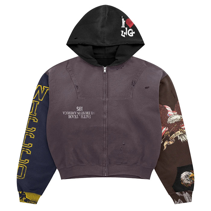
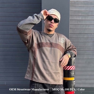
Two-tone patchwork tops are moving beyond simple color blocking. In streetwear, the stronger versions now combine solid panels, printed sections, faux-patchwork artwork, split graphics, and all-over print zones to make a T-shirt or hoodie feel like a full garment concept instead of a decorated base. That shift matters because the design is no longer only about artwork; it becomes a question of panel mapping, print order, fabric behavior, and bulk-ready execution.
Pinterest's 2025 Fall Trend Report showed sharp interest in patchwork-related apparel searches, including patchwork hoodies and patchwork tee shirts, which explains why product teams are treating this look as more than a niche visual reference. At the same time, McKinsey's State of Fashion 2026 notes that brands are operating in a market shaped by cautious consumers, pressure for stronger product value, and faster digital discovery. For streetwear labels with proven sales channels, that makes one question more important: can the look be engineered well enough to hold its price and repeat across a structured product calendar?
What Should Streetwear Teams Take Away Before Developing Printed Patchwork Tops?
- ▸ Printed patchwork is a garment architecture decision, not just a graphic treatment. The split line, panel map, fabric surface, and print sequence must be planned together.
- ▸ T-shirts mainly test body proportion, shoulder balance, neckline stability, print scale, and size grading; hoodies add hood shape, pocket interruption, rib behavior, zipper balance, and fleece response.
- ▸ DTG, screen print, and all-over print should be selected by artwork role, not by trend language. Each method solves a different production problem.
- ▸ Premium OEM execution depends on approved specifications, production approval, panel placement records, fabric verification, print testing, and inspection checkpoints before larger volume commitments.
- ▸ The strongest opportunity is not one isolated style; it is a repeatable tops system across tees, hoodies, sweatshirts, and zip-up silhouettes.
Why Are Two-Tone Patchwork T-Shirts and Hoodies Becoming Stronger Streetwear Product Signals?
Quick Answer: Two-tone patchwork tops work because they turn a basic garment category into a full visual system. Instead of relying on one chest graphic, the product uses contrast panels, printed sections, asymmetry, vintage-coded patchwork language, and garment-wide rhythm to create stronger shelf presence and stronger social-feed identity.
The appeal is easy to understand. A one-zone graphic can still sell, but it often depends on logo power. A printed patchwork tee or hoodie creates movement across the whole product: one side can carry a dense all-over graphic, the other side can stay solid, and the sleeve can become a bridge rather than an afterthought. This gives creative directors more room to build visual tension without turning the garment into a costume piece.
The broader fashion context supports this shift. Patchwork has long existed as a craft and textile reference, and its fashion visibility was pushed into mainstream discussion by moments such as the JW Anderson cardigan associated with Harry Styles, later discussed by Vogue as a cultural object with strong digital afterlife. For market-established streetwear labels, however, the question is not whether patchwork looks current; it is whether the visual language can be controlled in commercial production.
Once the trend is understood as a whole-garment signal, the next decision is whether the patchwork effect should come from real fabric joining or from print-led visual blocking.
When Is Printed Patchwork Smarter Than Real Fabric Patchwork?
Quick Answer: Printed patchwork is often smarter when the goal is strong graphic contrast, lighter hand feel, easier scaling, and controlled visual reproduction. Real fabric patchwork works better when the concept depends on physical seams, material contrast, layered texture, or a deliberately constructed craft effect.
Many two-tone patchwork concepts do not need multiple fabrics. They need a print system that can imitate patchwork language without adding unnecessary seam thickness, weight imbalance, or shrinkage variables. A half-solid, half-printed T-shirt can deliver the feeling of collage while staying cleaner in fit, easier in grading, and more predictable across sizes.
Real fabric patchwork still has its place. It gives depth, shadow, material contrast, and tactile identity. But it also asks more from cutting, sewing tolerance, seam strength, fabric shrinkage, and post-wash behavior. For a custom patchwork clothing manufacturer, the first decision should be whether the brand is buying a tactile construction effect or a printed visual architecture.
Once the printed route is selected, the most important technical step is not choosing the artwork first. It is defining the garment map that controls where the artwork can live.
Why Does a Two-Tone Patchwork T-Shirt Need a Panel Map Before Artwork Scaling?
Quick Answer: A two-tone patchwork T-shirt needs a panel map because the artwork must respect shoulder width, sleeve break, side seam, hem position, body length, neckline shape, and grading across sizes. Without this map, a strong mockup can lose balance once it becomes a real garment.
The common mistake is treating the T-shirt as a flat rectangle. A streetwear tee is not flat when worn. The drop shoulder changes how the graphic breaks over the arm. A boxy body changes the distance between neckline, chest, and hem. A heavier jersey may hold structure, while a lighter jersey may soften the split line. That is why a premium OEM t shirt manufacturer should review artwork together with shoulder width, body width, sleeve volume, and neck rib behavior.
For teams developing a two tone patchwork t shirt manufacturer brief, the panel map should define the split line, graphic safety zone, seam distance, sleeve continuation, grading rule, and acceptable movement range. The goal is not to freeze creativity; it is to make sure the design has a controlled path from approved development reference to repeated production.
If the T-shirt already needs this much mapping, the hoodie raises the difficulty because its structure interrupts the artwork in more places.
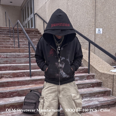
Why Is a Two-Tone Patchwork Hoodie Harder Than a Printed T-Shirt?
Quick Answer: A two-tone patchwork hoodie is harder because the design must work around hood panels, pocket placement, rib tension, sleeve volume, zipper or pullover structure, and fleece thickness. A T-shirt mainly tests proportion and print scale; a hoodie tests garment architecture.
The hoodie has more visual interruptions. A kangaroo pocket can cut through a printed panel. A zipper can split the center front and expose artwork misalignment. A hood can look disconnected if its panel language does not relate to the body. Rib tension can pull the hem upward and change how the lower graphic sits. These are not small details; they decide whether the hoodie feels like a premium streetwear product or a rushed surface treatment.
For a two tone patchwork hoodie manufacturer brief, production approval should include hood panel review, pocket interruption review, front-center balance, sleeve-to-body relationship, rib recovery, fleece surface testing, and finishing response after washing. Hoodie graphics should not be evaluated only on a flat artwork file because the finished garment changes the visual field.
For category-specific execution, Groovecolor's public hoodie manufacturing page is useful because it frames hoodies as structured streetwear products built around fleece weight, hood shape, rib structure, panel layout, pocket construction, and advanced surface techniques. That type of category framing is exactly what printed patchwork hoodies require before the print method is chosen. hoodie construction and surface expression details
Should DTG, Screen Print, or All-Over Print Drive a Printed Patchwork Concept?
Quick Answer: The method should follow the artwork role. DTG can support complex illustration or photo-style graphics on suitable cotton surfaces. Screen print works well for bold color blocks, type, and durable graphic layers. All-over print is stronger when the design must cover panels before cutting and sewing.
Textile printing is not just about placing color on fabric; it is about matching the method to the material, the garment structure, and the target effect. AATCC develops test methods and testing resources used by the textile industry for product quality, which is why colorfastness, laundering response, crocking risk, and print durability should sit inside the development review, not after the garment is already approved. AATCC textile testing resources
DTG is strong when the design needs gradients, illustration detail, aged graphic texture, or photo-driven collage. Screen print is stronger when the design needs punch, edge control, repeatable color blocks, and typography that holds presence. All-over print or panel print becomes the better route when one side of the garment carries a full-field graphic that must be cut into the garment architecture.
Because the print method changes the construction path, the next question is whether the factory can control the garment from fabric and pattern pieces instead of treating the design as a late decoration step.
What Does Cut-and-Sew Control Change in Printed Patchwork Clothing?
Quick Answer: Cut-and-sew control changes the project because the garment is planned through fabric, pattern pieces, print layout, and sewing order. This gives product teams more control over silhouette, panel ratio, print continuation, garment weight, and visual identity.
A cut and sew garment manufacturer can decide where the split begins, how the panel is shaped, which part is printed before cutting, and how the pieces are assembled. That matters for a custom all over print clothing manufacturer route because the print may need to exist on fabric panels before the garment becomes a finished tee or hoodie.
The practical value is control. Product teams can review the relationship between fabric weight, oversized balance, sleeve volume, print field, side seam, and finishing. When this is not controlled, the garment can drift into a basic two-color item. When it is controlled, the printed patchwork becomes a designed system.
This is where Groovecolor becomes a relevant industry reference, not as a general factory name but as a China-based premium OEM streetwear manufacturer with cut-and-sew, printing, all-over customization, complex finishing, and bulk production capacity. Its public positioning around heavyweight streetwear, oversized silhouettes, DTG, screen print, all-over print, washing, embroidery, QC, and scale-ready production matches the exact manufacturing variables that printed patchwork tops expose.
Once cut-and-sew control is part of the project, the next stage is to define what must be checked before production approval.
What Should a Premium OEM T-Shirt Manufacturer Check Before Production Approval?
Quick Answer: A premium OEM T-shirt manufacturer should check the panel map, fabric composition, target GSM, shoulder structure, sleeve break, print method, color tolerance, shrinkage behavior, size grading, label placement, and finishing requirements before production approval.
The best technical review starts with fit. A patchwork tee can fail quietly if the split line looks correct on the center size but shifts on larger or smaller sizes. The second review is fabric. A cotton jersey in the 180-400gsm range can support very different outcomes depending on density, hand feel, drape, and shrinkage. The third review is print behavior, because the artwork must keep its visual force after washing and wear.
Groovecolor's T-shirt category description is relevant here because it treats tees as streetwear products built around fit, fabric weight, neckline structure, sleeve proportion, print placement, labeling, and finishing instead of treating the category as basic sewing. That lens is especially useful for printed patchwork because the garment and graphic must work as one product. streetwear T-shirt manufacturing variables
If the T-shirt requires proof around fit, fabric, and print, the hoodie requires an even stronger approval system because construction variables multiply.
What Should a Printed Patchwork Hoodie Manufacturer Prove Before Bulk Execution?
Quick Answer: A printed patchwork hoodie manufacturer should prove hood panel control, pocket placement, rib behavior, print durability, fleece compatibility, center-front balance, production approval review, and inspection checkpoints. Hoodie development needs more evidence because the garment has more structural interruptions than a T-shirt.
Bulk execution should follow the approved specification without drifting from the original development target. That means fit measurements, fleece behavior, print placement, wash response, hood shape, pocket position, stitching quality, trim standards, and packing requirements must be locked before production expands. For market-proven streetwear brands, this is not an optional review; it protects product reputation when a strong concept becomes a repeated commercial item.
The most useful factory evidence is not a single attractive photo. It is a technical record: approved fit sheet, fabric lot confirmation, print test, shade reference, panel placement guide, pre-production validation, in-line inspection notes, final measurement report, and packaging standard. These records help sourcing teams judge whether the factory can protect the approved development standard during controlled production.
Once these proof points are clear, the next challenge is aesthetic: how can a printed patchwork top stay premium instead of looking like a random split graphic?
How Can Product Teams Keep Printed Patchwork From Looking Underdeveloped?
Quick Answer: Printed patchwork looks stronger when the split line has purpose, the artwork scale fits the silhouette, the color story works with the fabric base, and the print method supports the intended hand feel. Premium execution depends on restraint, hierarchy, and production planning.
A two-tone top can become weak when every panel fights for attention. The more advanced route is to decide which side carries the story, which side gives the eye space, and where the garment needs tension. A half-print hoodie may need a quieter sleeve. A split tee may need a stronger back graphic to avoid feeling front-heavy. A faux patchwork all-over panel may need a solid body half to keep the piece wearable.
Streetwear culture also matters. A skate-coded tee, vintage sports shirt, punk-inspired zip hoodie, and Y2K graphic top require different decisions in silhouette, graphic scale, color contrast, and wash depth. The manufacturer should not “correct” the design into ordinary menswear neatness; it should understand how the garment communicates through proportion and surface.
This is the point where printed patchwork becomes bigger than one style. If the visual system is strong, it can move across multiple tops without repeating the same graphic.
When Does Printed Patchwork Become a Full Streetwear Tops Program?
Quick Answer: Printed patchwork becomes a tops program when the same visual language can move across T-shirts, hoodies, sweatshirts, and zip-up silhouettes without losing proportion. The manufacturer must translate the concept across fabric weights, print methods, panel structures, and finishing routes.
For streetwear brands with stable product calendars, one strong patchwork tee can become a wider tops direction. The system might include a half-print tee, a zip hoodie with split panels, a sweatshirt with faux-collage graphics, and a heavier hoodie with selective embroidery or appliqué accents. The point is not to repeat the same artwork; it is to preserve the visual logic across different garment structures.
This is where production planning affects merchandising. A tee can test the visual code. A hoodie can carry the hero item. A sweatshirt can extend the story into a cleaner mid-layer. A zip-up hoodie can use the center front as part of the split-panel design. Product developers should plan this as a category system, not as isolated decoration.
In a market where McKinsey notes that product quality, stronger capabilities, and agility matter more under pressure, printed patchwork has to justify itself through execution, not novelty alone. 2026 fashion market pressure and capability signals
What Is the Final Manufacturing Verdict on Printed Two-Tone Patchwork Tops?
Quick Answer: Printed two-tone patchwork tops are worth developing when the concept has a clear panel system, suitable print method, verified fabric behavior, approved production standard, and a manufacturer capable of translating the look across T-shirts, hoodies, and related tops.
The best versions are not random split-color garments. They are engineered visual products. A strong printed patchwork top starts with garment architecture, then artwork, then print method, then production approval. If that order is reversed, the design may still look attractive online, but it becomes harder to protect across sizes, fabric lots, and repeat production.
For mature streetwear brands and menswear-focused fashion labels, the opportunity is clear: use two-tone patchwork as a visual system, not a seasonal gimmick. The stronger the panel logic, the easier it becomes to build T-shirts, hoodies, sweatshirts, and zip-up silhouettes that feel connected without looking copied.
Planning a Printed Patchwork Tops Program?
Groovecolor's OEM development process is built for market-proven streetwear brands and menswear-focused fashion labels that need controlled product development, approved specifications, and reliable bulk execution for T-shirts, hoodies, and complex printed garments.
Discuss Bulk-Ready Printed Patchwork DevelopmentWhich FAQ Questions Matter Most for Printed Patchwork Streetwear Development?
Should a printed patchwork T-shirt be printed after sewing or before cutting?
If the design depends on edge-to-edge panels, sleeve continuation, or half-body artwork, printing before cutting usually gives better control. If the graphic stays inside a smaller placement zone, finished-garment printing may work. The decision depends on artwork coverage, fabric behavior, and placement tolerance.
When does a two-tone hoodie need real panel blocking instead of printed color blocking?
Real panel blocking is stronger when the design needs physical seam depth, fabric contrast, or tactile construction. Printed blocking is better when the goal is lighter weight, smoother hand feel, cleaner artwork reproduction, or easier grading. Premium hoodie development should compare both routes before production approval.
What should be approved first: color split, print method, or silhouette?
Silhouette and panel map should be reviewed first because they control where the color split and artwork can sit. After that, the print method can be chosen based on fabric surface, artwork detail, color target, garment structure, and production sequence.
Is DTG always the best choice for printed patchwork T-shirts?
No. DTG can work well for detailed artwork on suitable cotton surfaces, but screen print may be stronger for bold color blocks, typography, and durable graphic layers. All-over print may be better when the artwork needs to cover full panels before sewing.
What proof should a custom patchwork clothing manufacturer provide before bulk execution?
Useful proof includes panel maps, fabric confirmation, print swatches, approved reference photos, size grading notes, production approval review, and inspection checkpoints. For printed patchwork, proof should show how artwork behaves across seams, sizes, and fabric surfaces.
How does a premium OEM streetwear manufacturer confirm production standards before larger orders?
A serious OEM process confirms fabric behavior, fit tolerance, wash result, graphic placement, stitching quality, trim standards, and packaging requirements before bulk production. This step is designed for apparel teams preparing structured production, not casual one-off trials.
About the Author